
This guide gives you an in-depth look at everything you need to build an eCommerce landing page or home page.
An effective landing page doesn't just welcome visitors. It walks them through a process of discovery and persuasion that leads them to take key actions, like buying. To get there, you need a page that looks good, feels intuitive and persuades, but above all presents the product in a way that resonates with the reader's emotions and curiosity in that moment.
It's a fundamental step for any online project. When it works, the message can go beyond the landing page copy and turn into videos, images and recommendations for your product from chatbots such as Gemini, ChatGPT and Perplexity.
Later in this guide, after looking at the science behind this workflow, we'll use a prompt that works as a blueprint for writing professional, engaging copy.
We'll take the prompt apart step by step and look at each element, so you understand how to use the results to create effective content that doesn't just inform but also persuades.
Our goal is to build a landing page that best reflects the brand identity, meets customer needs and drives as many conversions as possible.
The neuroscience topics I'm going to cover are nothing new. Someone might object: "Nothing a ChatGPT prompt couldn't tell you." Except the person who pulled them together over 25 years of experience and found a way to apply them to AI is me.
Note: these and other principles are built into all Marketing Hackers tools, not just this guide.
So if neuroscience isn't your thing, you can skip straight to the prompt: the table of contents is in the bottom right.
A Scientific Analysis of UX Copywriting and Human Behavior
Digital design has gone through a radical transformation, from an aesthetic and functional practice to a complex scientific discipline at the crossroads of behavioral psychology, cognitive neuroscience, computational linguistics and behavioral economics.
Every element, from the color of a button to the choice of words, isn't decoration but a biological stimulus that influences decisions. UX writing, too, stops being plain creativity and becomes a technical tool whose job is to reduce cognitive friction and line up messages with the heuristic biases already present in the user's brain.
To do this, we bring together the pillars of persuasion, drawing on BJ Fogg's model (Fogg Behavior Model) and Kahneman's Prospect Theory to understand what really drives motivation, moving past the old Unique Selling Proposition and adopting the 'Distinctive Assets' approach of the Ehrenberg-Bass Institute.
Today the goal isn't just to stand out, but to make the brand instantly available in the consumer's memory .
Today we have the tools to manipulate brain chemistry by stimulating dopamine (motivation) and keeping cortisol (stress) in check, for use in "ethical", concrete conversion strategies.
Persuasive Technology
Interface design has always focused on usability, defined as the effectiveness, efficiency and satisfaction with which specific users reach specific goals.
But with the arrival of "Captology" (Computers as Persuasive Technologies), a term coined by B.J. Fogg, the focus shifted to technology's ability to influence attitudes and behaviors without coercion or deception, through intentional design.
Usability removes barriers; persuasion provides the motivational push. The scientific literature distinguishes between macrosocial and microsocial persuasion, but for our purposes we'll focus on procedural persuasion: using structured processes to guide the user through a decision funnel with the PSD model.
The PSD (Persuasive System Design) model by Oinas-Kukkonen and Harjumaa extends Fogg's work with a taxonomy of 28 persuasive design principles, grouped into primary task support, dialogue support, credibility support and social support. Because persuasion isn't a single event. It's an ongoing dialogue between the system and the user.
The Fogg Behavior Model (FBM): The Equation of Action
Fogg's Behavior Model (FBM) is the cornerstone for understanding why users act or give up.
The formula B = MAP says that a Behavior only happens when three factors converge at the same moment: Motivation (M), Ability (A) and a Prompt (P) (or Trigger). If even one of these is missing, the action doesn't happen, no matter how good the product or service is.
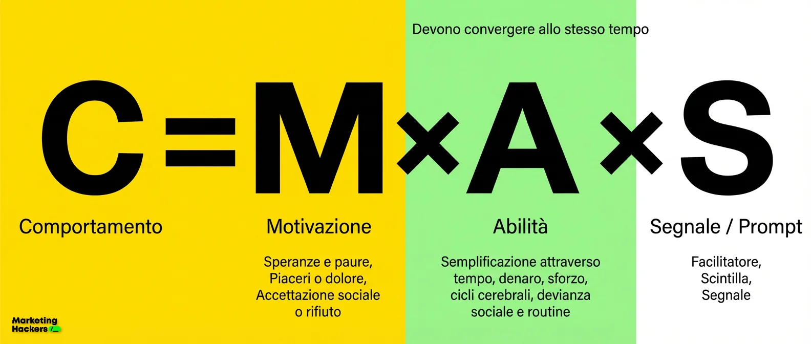
Let's look at the factors that trigger behavior.
How Motivation Works
Motivation is the most volatile part of the equation.
Fogg identifies three "Core Motivators" rooted in our evolutionary biology:
Sensation: Pleasure vs. Pain. These are immediate, visceral motivators. UX copy that promises "delivery in 24 hours" plays on the pleasure of instant gratification, while "avoid the fines" plays on avoiding pain.
Anticipation: Hope vs. Fear. Hope is the expectation of something good in the future, fear is the anticipation of a loss: "hope" sells beauty products and training courses, while "fear" sells insurance and security software.
Belonging: Social Acceptance vs. Rejection. Being accepted by the group is a survival imperative. Platforms like LinkedIn and Instagram tap into this motivator.
The key thing to understand is that motivation fluctuates. Fogg calls this the "Motivation Wave". When the wave is high, users are willing to take on complex actions (like filling out a long signup form). When it drops, they can only manage simple ones. So persuasive design has to use motivation peaks to get people to take actions that shape their future behavior (e.g. saving a credit card for one-click purchases later).
Ability as Managing Simplicity
In the FBM, ability doesn't refer to the user's skills but to how simple the task is. If a task is hard, perceived ability is low, so we need to make visitors feel "able" to move through our offer without friction.
Fogg defines six elements of simplicity that design needs to get right:
| Simplicity Factor | Description in a UX Context | Copy Optimization Example |
|---|---|---|
| Time | The perceived (or real) time needed to complete the action. | "3-minute read" (instead of showing a solid wall of text). |
| Money | The financial cost or the perceived financial risk. | "Free trial, no credit card required". |
| Physical Effort | The number of clicks, scrolls, mouse movements or keystrokes required. | "Sign in with Google" (removes the friction of filling in fields). |
| Brain Cycles | The cognitive load: how much the user has to think to figure out what to do. | Plain language, no technical jargon, unambiguous button labels. |
| Social Deviance | The fear of doing something outside the accepted norm. | "Join 10.000 users" (uses Social Proof to make the action feel normal). |
| Non-Routine | The difficulty of taking an action that means breaking established habits. | Emphasis on compatibility with the existing workflow (e.g. "Integrates perfectly with Slack"). |
Research shows that increasing ability (by making the task simpler) is often more effective and cheaper than trying to increase motivation.
The "Tunneling" principle in the PSD model backs this up: guiding users through a predetermined process cuts down on complex navigation and decision-making, which raises perceived ability.
The Prompt: The Spark of Action
Without a Prompt, motivation and ability don't turn into behavior. Prompts have to be designed around where the user sits on the B=MAP chart
Spark: needed when ability is high but motivation is low. The copy has to be emotional or urgent ("Last chance!").
Facilitator: needed when motivation is high but ability is low. The copy has to reassure and simplify ("It's easy, we'll walk you through it").
Signal: needed when both motivation and ability are high. It only works as a reminder ("Your download is ready").
The common mistake is sending "Signals" to users who lack motivation (which annoys them) or "Sparks" to users who lack ability (which frustrates them).
Social Psychology and Choice Architecture
Cialdini (Beyond the Guru Fluff)
By now everyone and their uncle quotes Cialdini, so I won't spend long on him, except to draw a few important distinctions. "Marketing gurus" sell him as a magic formula and ignore the fact that online there are no nonverbal cues. Applying his laws to the web without adapting them isn't science. It's snake oil.
Reciprocity isn't the usual "email for a PDF" shakedown (that's a transaction). It means giving real value before you ask for anything. Social proof needs precise numbers, not empty adjectives like "we're the leader". And scarcity with fake countdowns is infomercial stuff that people see through instantly: either it's real, or you look like a scammer. Online, Authority is visual first (an ugly website destroys trust faster than any certificate), and Unity means speaking your tribe's slang, not just being likable.
The Neurobiology of Decision-Making
The Triune Brain and the Levels of Decision-Making
Even though MacLean's "Triune Brain" theory is considered scientifically outdated, it's still a useful working model in neuromarketing for telling apart three levels of processing:
Reptilian Brain (R-Complex): handles survival instincts, attention and the "Fight or Flight" response. It reacts to strong visual contrast, movement and simple concepts (start/end, danger/safety).
Limbic System: the seat of emotion and memory. This is where buying decisions happen (the "gut feeling"), and they get rationalized afterward.
Neocortex: handles logical thinking, complex language and rationalization.
Effective copy speaks to the reptilian brain first (to grab attention), then to the limbic system (to create emotional desire) and finally to the neocortex (to provide logical reasons).
If the triune brain is the architecture of decision-making, neurotransmitters are the chemical fuel that drives its deeper mechanisms. To turn this structure into conversions, you need to understand how to modulate the substances that regulate desire, stress and trust.
The table below sums up the three essential biochemical levers for shaping the user experience:
| Neurotransmitter | Role in Marketing | Key Psychological Concepts | Practical Application (Copy & UX) |
|---|---|---|---|
| Dopamine(The Accelerator) | Anticipation and DesireNot the final pleasure, but the motivational drive to go after the reward (Seeking System). | • Reward Prediction Error: Uncertain rewards drive more action.• Open Loops: Curiosity creates an information gap that begs to be closed.• Hyperbolic Discounting: The brain prefers immediate rewards. | • Headlines: Use questions or "secrets" to open mental loops.• Urgency: Words like "Now", "Right away", "Instant".• Gamification: Notifications and variable rewards. |
| Cortisol(The Brake) | Stress and AbandonmentA response to ambiguity or lack of control. It blocks rational decision-making and makes people "flee" the site. | • Decision paralysis: Anxiety inhibits the prefrontal cortex.• UX friction: Confusion about costs or processes. | • Text-based anxiolytics: "No hidden fees", "Cancel anytime".• Feedback: Confirm every action ("Message sent").• Predictability: Explain what happens after the click. |
| Oxytocin(The Glue) | Trust and EmpathyIt strengthens social bonds and makes people more inclined to buy or donate. | • Storytelling: A dramatic narrative structure stimulates its chemical synthesis.• Identification: Empathy with the hero of the story. | • Hero's Journey: Customer-centered stories on the "About Us" page.• Testimonials: Real human stories instead of cold data.• Tone of Voice: Warm, human and relational. |
Cognitive Biases and Heuristics in Copywriting
Prospect Theory and Loss Aversion
Daniel Kahneman and Amos Tversky turned economics upside down with Prospect Theory, showing that people aren't rational actors chasing maximum utility. They weigh gains and losses against a neutral reference point.
Loss Aversion: the psychological pain of losing an amount $X$ is about 2–2.5 times greater than the pleasure of gaining the same amount $X$
How It Applies to Message Framing
Beyond biochemistry, a message's success depends on how the information is "framed": the so-called Framing Effect. Shifting the perspective between gain and loss can flip how value is perceived, pulling different motivational levers depending on the specific goal, as shown below:
| Frame Type | Message Focus | When It Works | Practical Example |
|---|---|---|---|
| Gain Frame(Focus on Gains) | Emphasizes the positive benefits and the improvement over the current situation. | Promotion products or active preventive behaviors (e.g. exercising, investing). | "Save 100€ a year on energy.""Exercise to feel better." |
| Loss Frame(Focus on Losses) | Plays on the fear of losing something (Loss Aversion) or of being harmed. | Risk prevention products, health screenings and urgent situations. | "Stop wasting 100€ a year.""If you skip the screening, you risk missing the disease." |
| Endowment Effect(Abandoned Cart) | Shifts the focus from the pain of spending to the fear of losing something that already feels like "yours". | Sales recovery. The goal is to bring back the sense of ownership built up while browsing. | "Your item is about to expire"(More effective than a generic "Come back and shop"). |
The Anchoring Effect
Anchoring is our tendency to rely too heavily on the first piece of information we're given (the anchor) when we make decisions.
Pricing: showing the Full Price struck through next to the Sale Price creates a high anchor, so the final price feels like a bargain, even when the sale price is still high.
Semantic Anchoring: words and concepts work as anchors too. Describing a product as "Premium" or "Exclusive" before revealing the price prepares the user for a high number and softens the sticker shock (Price Priming).
The Paradox of Choice (Choice Overload)
Sheena Iyengar and Mark Lepper showed that offering too many options can reduce both sales and satisfaction (the Paradox of Choice). Cognitive overload paralyzes decision-making.
Copy Strategy: Copy should act as a curator. Instead of presenting 10 identical options, use directive labels like "Best for beginners", "Best Value", "Pros' Choice". This reduces the mental computing needed to compare the options.
The Zeigarnik Effect and the Need for Closure
Bluma Zeigarnik noticed that interrupted tasks are remembered better than completed ones. The brain keeps the task active in a state of cognitive tension until it's resolved.
UX Pattern: progress bars (e.g. "Profile 65% complete") use this effect. The copy should highlight what's missing to reach completion ("Just one more step to secure your account").
Strategic Psycholinguistics and Microcopy
Psycholinguistics studies the cognitive processes involved in using language. Every word you choose has a processing "cost" and an emotional impact.
Verb Semantics and Friction
Generic button labels like "Click here", "Submit" or "Continue" suffer from a weak "Information Scent" (a theory put forward by Pirolli & Card in 2007). Users have to spend mental energy remembering what will happen after the click.
Predictive Verbs: Button copy should complete the implied sentence "I want to...". So: "I want to...", "I want to... [Create an Account]". This reduces uncertainty and cortisol.
The Power of Verbs: Specific action verbs (e.g. "Book", "Discover", "Start") activate the brain's motor areas (Mirror Neurons) more effectively than abstract nouns.
Trigger Words and Emotional Impact
Some words act as "super-stimuli".
"Free": Dan Ariely showed that the difference between €0.01 and €0.00 is psychologically huge, far bigger than the difference between €0.02 and €0.01. "Free" removes the risk of loss entirely and triggers an irrational positive response (the "Zero Price Effect").
"New": stimulates the brain's dopamine-driven seeking system. It's rooted in evolution: anything new in our environment could be a resource or a threat, so it gets priority attention.
"You": The word that grabs attention most. The "Cocktail Party Effect" shows that our brains are tuned to pick up references to ourselves even in noisy environments. Using "you" often keeps attention focused.
Cognitive Load and Readability (Processing Fluency)
Before we even get to fluency, we need to look at how the mind is built. John Sweller's Cognitive Load Theory teaches us that our "working memory" is a bottleneck: it can only handle 4-7 items at a time. In landing page design, anything that doesn't directly help conversion (messy graphics, wordy copy, cluttered layouts) creates what Sweller calls "Extraneous Cognitive Load". This mental noise saturates the user's working memory, keeps them from moving information into long-term memory and, as a result, from making a decision. Our job is to cut this useless load to zero and leave room for the sales message.
"Processing Fluency" is how easily a piece of information gets processed. The brain uses fluency as a heuristic to judge truth and safety. If something is easy to read, it feels true and safe (the Truth Effect).
Simplification: using short words and simple syntax doesn't mean "dumbing it down". It means respecting the user's limited cognitive resources. Complex sentences or hard-to-read fonts kick System 2 into gear and make the task itself feel harder.
Beyond the USP - The New Science of Branding
The Decline of Functional Differentiation
For decades, marketing was ruled by Rosser Reeves' theory of the Unique Selling Proposition (USP)
"Each advertisement must make a proposition to the consumer... one that the competition either cannot, or does not, offer".
The problem is that in saturated, mature markets, finding real functional differentiation is almost impossible. Products are often similar, and consumers rarely notice meaningful differences.
Distinctiveness vs. Differentiation (Ehrenberg-Bass Institute)
Empirical research by Byron Sharp and Jenni Romaniuk at the Ehrenberg-Bass Institute shifted the focus from Differentiation (being different in meaning/function) to Distinctiveness (being different in identity/recognizability).
Differentiation: relies on convincing the user that the product is better for a specific reason. It requires deep cognitive processing.
Distinctiveness: relies on making the brand easy to notice and recognize (Salience). It uses sensory Distinctive Brand Assets (DBAs) that trigger memory effortlessly.
Building Distinctive Verbal Assets
Visual DBAs (logo, colors) are well known, but the copywriter has to build verbal DBAs to take up space in the consumer's mind (Mental Availability).
Proprietary Tone of Voice (ToV): being "friendly" isn't enough. The ToV has to be codified along specific dimensions (e.g. the Nielsen Norman Group framework: Funny vs. Serious, Formal vs. Casual, Respectful vs. Irreverent, Enthusiastic vs. Matter-of-fact). A unique combination of these dimensions, kept consistent over time, becomes a distinctive asset.
Proprietary Vocabulary: create words or phrases only your brand uses. Example: Disney doesn't have "customers" and "employees", it has "guests" and "cast members". This vocabulary reinforces the brand's frame with every interaction.
Recognizable Sentence Structures: a brand can stand out through the systematic use of clipped, telegraphic sentences (Nike style) or long, emotional storytelling (Dove style). Consistent syntax creates a recognizable "rhythm".
What This Means for Copy: Instead of desperately trying to explain why the product is "better" (which often breeds skepticism), copy should focus on being unmistakable, memorable and mentally available when the need arises (Mental Availability).
Visual Attention and Information Hierarchy
The neuroscience of vision teaches us that "seeing" isn't like taking a photo. It's a constructive process. The eye moves in saccades (rapid movements) and fixations. We don't read. We scan for keywords and meaningful patterns.
Eye Scanning Patterns (Eye Tracking)
Eye-tracking research (e.g. Nielsen Norman Group) has identified universal patterns in how people consume web content:
| Pattern | Behavior | Copywriting Implications |
|---|---|---|
| F-Pattern | Text-heavy pages.Users read the first lines horizontally, then move down the left side reading less and less, tracing an "F". | Front-loading: Keywords and key benefits need to come at the start of the headline, the paragraph and the sentence (the first 2 words). Don't hide vital information on the right or at the end. |
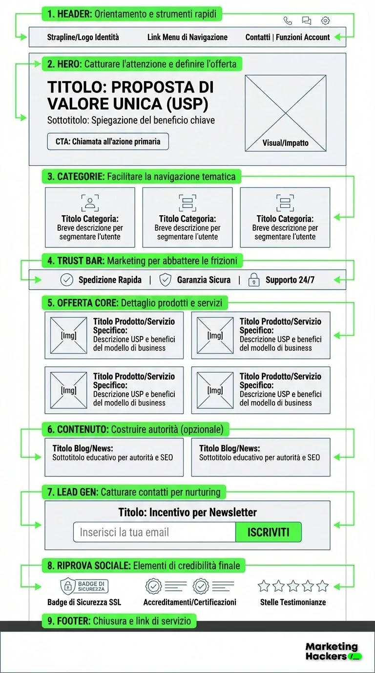
| Z-Pattern | Landing pages / Visual pages.A zig-zag movement: horizontal across the top (left to right), diagonal through the middle, horizontal across the bottom. | CTA path: Put the Value Proposition in the top left (the start) and the main Call to Action in the bottom right (or bottom center), where the eye naturally lands last. |
| Layer Cake | Scanning by headings.Users jump from one heading to the next and skip the body text entirely (like eating only the frosting and the layers of the cake). | Standalone Headings: Subheadings (H2, H3) shouldn't be cryptic. They need to tell the whole story on their own. If users only read the headings, they should still understand the offer and the benefits. |
Try tracing these patterns on the next image and you'll see that nothing is left to chance
If it's even possible to take all of this in at once, you now know why, when your AI prompts are "write an article about…" or "summarize this…" or, worse, "write a landing page…", your readers see through you right away, on top of the fact that the results are total platitudes.
But if we can build the right context with the right information and instructions, using science to guide the AI model, the game changes completely.
Here's how.
The prompt
Here's the prompt, split into sections you can copy and paste, with an explanation of exactly what each one does and what you'll need to do. Remember, it's one single superprompt. So you copy and paste the sections, run the prompt and start working with the machine.
Role, Instructions and Rules
In this section we tell the machine which role to play, plus the rules and constraints
Preparation
The Business Model
The first step in building a successful eCommerce landing page is understanding the business model inside out. You need this to create content and a layout that actually meet the needs of the brand and its customers.
In this step, we focus on gathering the information we need. That includes a detailed description of the business model, the target audience, the company's strengths and weaknesses, market opportunities and any key information that could shape the structure and content of the landing page.
This step lays the foundation for everything that follows. Without a full understanding of the business model, you risk building a landing page that doesn't accurately reflect the brand identity or doesn't speak directly to the target audience's needs.
Defining "Distinctive Assets" and Tone of Voice
Tone of voice is one of the most important parts of a brand's communication. It shapes how visitors perceive the brand's message, and it has to stay consistent across the whole landing page. Once you understand the business model, the next step is choosing the tone of voice that best fits the target audience.
The tone of voice you choose will have a big impact on how visitors perceive the brand and its offer. It needs to match the brand's values and help build an emotional connection with the audience.
Emotional Triggers
Once you've defined the tone of voice, you need to figure out which emotions you want to spark in the people who visit your landing page. Emotional triggers are key factors that shape user behavior and push people to take specific actions, like making a purchase or signing up for a newsletter. Used well, they're powerful persuasion tools that can make the difference between a passive visit and an active conversion.
According to the Fogg Behavior Model, a behavior only happens when Motivation, Ability and a Prompt converge. Picking the right biological lever (e.g. "Fear" for insurance) is essential to trigger the action.
The Strapline (Slogan) for the Reptilian Brain
The strapline, or tagline, is a short phrase that sums up the essence of the brand in a concise, memorable way. It's often one of the first things visitors notice on a landing page, so it has to get the brand's key message across. A good strapline helps visitors understand right away what makes your brand unique, shapes how they see it and gives them a reason to keep exploring your offer.
The reptilian brain is the first to filter information; it responds to simple concepts, survival instincts and strong contrasts. A complicated strapline gets ignored because it takes too much cognitive effort.
Headline and Value Proposition (Framing and Dopamine)
The headline is one of the most important parts of the landing page, because it grabs the visitor's attention instantly and makes them want to keep reading. It has to clearly communicate the brand's value proposition or Unique Selling Proposition (USP), highlighting what makes the offer unique and worthwhile for the customer.
The headline is the entry point for visitors to your landing page, and it has to create an instant connection with the audience so they want to know more.
The sub-headline takes the value proposition further, making clear what the company offers and why the visitor should choose its products or services.
The sub-headline has to support the headline and give one more reason to keep exploring the landing page.
Prospect Theory shows that the pain of losing is 2 times stronger than the pleasure of gaining. Words like "New" or "Secret" also stimulate the Dopamine system (curiosity).
The stress of uncertainty releases cortisol, which inhibits rational decision-making. Social Proof works like a natural "anxiolytic", reducing uncertainty through other people's behavior
Creating the Calls to Action (Psycholinguistics and Microcopy)
Calls to Action (CTAs) are fundamental on an eCommerce landing page, because they guide visitors toward the action you want, like making a purchase, signing up for a newsletter or asking for more information. A well-designed CTA is visible, clear and persuasive; it keeps friction to a minimum and makes the visitor's decision easier. CTAs are the engines of conversion on a landing page. They need to be designed and placed with care to guide visitors toward the action smoothly and naturally.
Using "My" increases CTR by up to 90% thanks to the Endowment Effect (feeling like the item is already yours). Predictive verbs reduce uncertainty about what will happen after the click.
Products or Services Section
Once you've created the CTAs, it's time to define the headline for the landing page section dedicated to the products or services on offer. This section is key to presenting what the brand offers in a clear, appealing way that gets visitors to explore the options. The products or services section headline is essential for catching visitors' attention and encouraging them to explore what the brand has to offer. It has to be clear, concise and motivating.
Iyengar and Lepper's research shows that too many options paralyze consumers. The section headline shouldn't be just a label (e.g. "Our products"). It has to act as a strategic guide that helps the brain categorize and choose, reducing the mental computing needed to compare the options.
Processing Fluency: the brain uses ease of reading as a shortcut (a heuristic) to judge whether information is true and safe. If the services section headline is easy to process, users feel a sense of familiarity and trust, which lowers cortisol (the stress of uncertainty).
Since users scan the page instead of reading word for word, the headline has to follow the Front-loading technique. Putting keywords or benefits first makes sure the message gets through even during a quick scan (the "F" or "Layer Cake" pattern).
Main Categories
Once you've defined the headline for the products or services section, the next step is to identify and highlight the main categories in your offer. These categories are the most important or popular products or services you want to promote on your landing page. Make sure they're clearly defined and visually appealing, so they invite exploration and interest.
Users move around the web like ancestral hunters: they follow the "scent of information" (Information Scent).
If the category label doesn't match the user's mental model (e.g. looking for "Sleep better" instead of "Melatonin"), the "scent" is lost. The user senses a poor return on their energy and abandons the "hunt" (your site).
Customer Reassurance
A key part of any eCommerce landing page is reassuring customers that buying from your site is the right choice. This matters even more online, where customers can't see the products in person or talk directly to a sales rep. Reassuring customers is a fundamental step to reduce their hesitation and increase conversions. Showing proof of quality, security and satisfaction can make the difference in getting visitors to complete their purchase.
This section turns the headline into a powerful biochemical trust trigger, easing the cortisol caused by ambiguity and acting as a natural anxiolytic for the user's limbic system.
By combining the levers of social proof and authority, the message drastically cuts the cognitive effort it takes to trust, while identity-driven language strengthens the sense of belonging to the brand. Finally, the fluency that comes from keeping it short isn't just about looks: it relies on the "Truth Effect", pushing the brain to instinctively accept the information as true precisely because it's easy to process.
Blog/News/Tutorial Content
The Blog/News section of an eCommerce site plays an important role in engaging users and building brand authority. With relevant, informative content, you can educate, entertain and hold visitors' interest, building a stronger bond with your audience and encouraging loyalty. The Blog/News section is a key resource for keeping visitors informed and engaged. The right headline and a good choice of topics can help build an active community around the brand and improve the site's SEO ranking.
Finally, the output we want to get
You've finished the guide to building an eCommerce landing page with this prompt. Each chapter walked you through a structured process, from understanding the business model to writing strategic copy for every section of the landing page. This approach lets you build a page that looks good and works well, and that also speaks directly to your target audience, guiding visitors along a clear, persuasive path that ends in a conversion.
Now that you have everything you need, you can start putting this copy into your landing page design. Make sure you test the page to check that everything works as expected and that visitors can easily find the information they need.
Good luck with your eCommerce project!
If you found this useful, help us grow. The goal is to become a big community hungry for knowledge, so we can ask companies for discounts, early access, event invitations, funding to keep the project running and perks for members of Marketing Hackers, which will always be free.
The more of us there are, the more we'll get. So if you like the project, share it with your colleagues and friends and invite them to sign up so the knowledge spreads and nobody gets left behind.
Stay Tuned!
Cosa ottieni iscrivendoti:
- Accesso a tutti gli episodi della newsletter
- Guide e corsi completi sull'AI per marketer
- Strumenti AI professionali (BrandPix, Short Video Suite)
- Crediti gratuiti per iniziare subito