Cinematic Websites for Premium Fashion Brands
Premium fashion brands use video and cinematic scroll to convey fabric and movement, then guide shoppers to the product without losing sales.
You get a little over eight seconds. That’s the average attention span of someone landing on a page today, down from 12 seconds to 8.5 between 2000 and 2015, which puts us below the figure usually quoted for a goldfish.1 In that window, a premium fashion brand’s website has to make people feel the fabric, the movement and the mood of a campaign, then walk them to the product without slowing down anyone who’s already decided to buy. That’s where a cinematic fashion site either earns its keep or turns into a beautiful gallery nobody shops from.
It works on one condition. The brand has to produce visual content every season, and the story has to lead to the product instead of burying it. If you’re weighing a rebuild, what follows is the process we use for premium cinematic websites.
Why fashion is the natural home for a cinematic site
Fashion sells things a still photo struggles to convey. The way a fabric falls, the swish as someone walks, light shifting across a texture. Video and narrative scrolling put that movement back on the screen. Small wonder the fashion film has become an effective and fast-growing way for brands to talk to their audience.2 It’s one of the newest forms of digital content built for that conversation between brand and customer.2
Your website is also the one shop window you control completely. On a marketplace or in a multi-brand store, your piece sits next to dozens of others, under visual rules someone else set. On your own domain, you set the pace, the order and the tone. That matters in an industry where the physical store still does the heavy lifting. In 2025, more than 70% of revenue for the big fashion and luxury players still came from offline channels.3 The site becomes the bridge between the campaign people saw on social and the boutique they’ll walk into, or the basket they’ll fill.
A good high-end fashion brand website borrows the Gucci or Dior playbook. Their production budgets are out of reach for a company turning over €1-1.5 million. Their method isn’t: a handful of strong assets, a linear story and load times that live up to the anticipation.
Where cinematic sells and where it costs you orders
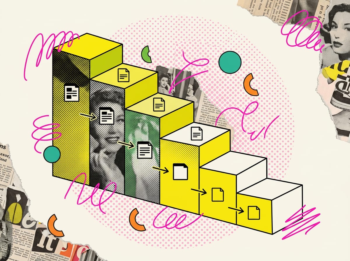
The most expensive mistake is treating every page the same. Motion, full-screen video and animated transitions earn their place where visitors are still deciding whether they like the brand. They get in the way once someone has made up their mind and just wants to finish. Scroll effects that hijack the page throw off anyone trying to get a task done, and in the basket and checkout every extra second of waiting is an order you might lose.
High-end fashion web design needs a different dose on every page.
| Page | Cinematic level | Why |
|---|---|---|
| Homepage and campaign | High | First impression: it has to convey the brand’s world in a few seconds |
| Brand story and atelier | High | The story builds trust and justifies the price |
| Collection lookbook | High-medium | Full-screen looks, with a quick route to the piece |
| Category listing | Low | People here are comparing and filtering, they want speed |
| Product page | Medium | Yes to on-body video and fabric zoom, no to animations that lock the scroll |
| Basket and checkout | Zero | Every distraction or delay kills the sale |
There’s hard evidence for investing in looks where visitors make up their minds. Impulse buying accounts for 40 to 80% of all purchases, and a study of 900 consumers found that putting visual product aesthetics front and centre amplifies that impulse to buy online.4 Without the cues of a physical store, visual aesthetics carry more of the job of grabbing attention. Page layout plays a part too. Three studies on website design found that warm colours, a few large images and a layout with visuals on the left and text on the right produce a more positive emotional response, and that emotion feeds purchase intention.5 Cinematic design is a richer take on the same principle, best used with restraint.
The site as a seasonal system built for four collections a year
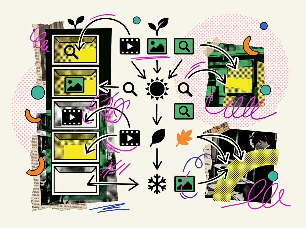
Here’s the real problem in fashion, and hardly anyone talks about it. A label swaps collections, drops, lookbooks and campaigns two, three, four times a year. A cinematic site hand-crafted once looks dated within six months, and by then updating it costs as much as starting over. The fix is to design an architecture of reusable modules, so each season you refresh the content inside a structure that stays put.
Modules you fill with each season’s content
Think of the site as a set of fixed blocks that take fresh content:
- Campaign hero video
- Collection chapter with a title and short copy
- Full-screen scrolling look
- Close-up detail on fabric and finishes
- “Shop the look” block that links to the pieces
Define once how formats, file weights and animations behave. From then on, the team drops each new season’s footage into the same containers. A knitwear label running two main collections a year plus two capsules refreshes the same framework four times, without calling in a developer every time.
The website brief is written alongside the shoot brief
The time to think about the site is when you plan the shoot, before a single frame is taken. If you decide up front that you need looping vertical clips and fabric close-ups, you get them in the same session and avoid booking the studio again in November to fill the gaps. A label presenting its autumn/winter collection at the end of summer should have the website brief signed off before the set goes up, so the content is shot in the right format from day one.
An SOP your in-house team can run on its own
For the system to hold, whoever updates the site needs to know exactly what to do. Here’s a five-step SOP your team can lift as is:
- Upload the season’s assets to the shared folder, already cropped to the agreed formats
- Write the copy for each collection chapter using the template
- Send it to the brand lead for a tone and consistency review
- Check file weights and mobile load speed
- Publish, and move the previous season to an archive page
For step 2, AI speeds up the slowest part: writing collection copy. Give ChatGPT or Claude a prompt along these lines. “You’re the creative director of an Italian knitwear label. Write three versions of the copy for the ‘Autumn Winter’ chapter of the website, 35 words max each. The theme is a return to raw Alpine wool, with a palette of stone grey, rust and cream. Avoid generic adjectives like elegant, refined, exclusive. Keep the tone spare and concrete.” You have a starting point in thirty seconds, and the brand lead polishes it. AI writes the first draft; a person still makes the call.
The visual assets you actually need
“Use high-quality images” is advice everyone gives and nobody can act on. What helps is knowing which assets to produce for each section, and in what format. Without a shoot planned for the web (vertical, looping, with fabric details), there’s simply no cinematic site to build.
The minimum list for one collection:
- A landscape campaign video for the hero, 8 to 15 seconds, with a lighter cut for mobile
- Looping vertical clips of looks in motion, made for thumb-scrolling
- Full-bleed shots of the key looks, few and large, as the research on design and emotion suggests5
- Macro details, from stitching and buttons to the weave of the yarn
- Clean product shots on a neutral background for the product pages
Format matters because your audience is on mobile. Time spent on mobile overtook desktop back in 2015.1 Shoot only in landscape and most of your visitors will see a rectangle with two black bars.
Fashion film covers a wide range of genres, from adverts to music videos to experimental shorts, and sits within a broader network of digital fashion media.6 Each season you need a clear direction before you shoot, and an auteur short film is optional. AI helps here again. To build the moodboard and the scroll storyboard, use Midjourney or another image generator to visualise lighting and composition references, then lock down the sequence with a prompt like this. “Create a shot list for a 12-second campaign video for a knitwear label, wintry mountain mood. List 6 shots with duration in seconds, shot type (detail, full figure, setting) and a note on movement. Vertical format for mobile.” You walk onto set with a precise plan, skip the improvising, and pay for fewer studio hours.
If you don’t have an in-house creative team, you can work with people who do this for a living, like the Marketing Hackers design team, while keeping control of the calendar and the SOP.
Where the story ends and the e-commerce begins
The technical question that stalls plenty of projects is where the storytelling stops and the shop starts. Same domain? Subdomain? Separate platform? The practical answer depends on how much you sell online and how much of your business runs through physical stores. With over 70% of fashion and luxury revenue still offline in 2025, for many labels the site is first a brand amplifier that drives people to the boutique, and a point of sale second.3
If online is a minor channel, a cinematic site with a few shoppable pieces and a clear prompt to book an in-store appointment does the job well. If e-commerce is growing, keep storytelling and catalogue on the same domain, each running on its own logic. The editorial side stays cinematic, the transactional side stays fast and plain. The visual identity carries through unchanged; only the pace shifts.
Virtual try-on is a front that’s maturing. A study of 162 people aged 18 to 35 found that an experiential augmented reality app raises purchase intention, with the effect driven by a positive emotional response.7 For a €1 million label it’s still a distant investment, but it shows where things are heading. The closer the online experience gets to the feel of the real product, the more likely browsers are to buy.
Measuring whether cinematic is working
A beautiful site that brings in no revenue is a cost. Before rebuilding, decide what you’ll measure. For a label this size, three numbers are enough. How many visitors go from the lookbook to a product page, how many go from a product page to the basket or an appointment booking, and how long it takes from the click on a campaign link to the first real contact.
Keep looks and performance in the same frame. Personalisation and a carefully crafted experience help conversion, provided the path to purchase stays smooth. If the cinematic homepage keeps visitors glued but few reach a product, the story is working against the sale, and the bridge between the two worlds needs fixing. The same principle applies to the sister verticals in this cluster, from luxury hotel websites to websites for wineries and gourmet food brands. Atmosphere gets people through the door; the process behind it turns them into customers.
A cinematic site for a fashion brand pays for itself when it’s built as a system that runs through four seasons a year, uses motion where it helps and lets the shopping pages breathe. Built that way, it keeps selling with every collection long after the first wow has faded.
Sources
Footnotes
-
Brand Narration and Fashion Films. davidpublisher.org ↩ ↩2
-
Fashion film and communication in the digital age. politesi.polimi.it ↩ ↩2
-
Cresce la digitalizzazione del settore Fashion & Luxury, ma … deloitte.com ↩ ↩2
-
Visual Product Aesthetics and Consumer Impulsiveness in … scholarspace.manoa.hawaii.edu ↩
-
Influence of Website Design on Consumer Emotion and Purchase Intention in Travel Websites. doi.org ↩ ↩2
-
Fashion Film and Genre Ecology. journals.uio.no ↩
-
The impact of experiential augmented reality applications on fashion purchase intention. hdl.handle.net ↩
FAQ
When is a cinematic website actually worth it for a fashion brand?
Only if the brand produces fresh visual content every season and the storytelling leads to the product instead of burying it. Without strong, up-to-date assets, the site turns into a beautiful gallery that doesn't sell.
Which pages should use cinematic effects, and which should avoid them?
Go heavy on the homepage, campaign pages, brand story and lookbook, where visitors are still deciding. Keep it light on category listings, cart and checkout, where people who've already chosen just want to finish fast.
Does the website matter if my brand sells mostly in stores?
Yes. In 2025, over 70% of revenue for major fashion and luxury players still came from offline channels. Your website bridges the campaign people saw on social media and the boutique they'll eventually walk into.
Do I need a production budget like Gucci or Dior?
No. Their budgets are out of reach for a company turning over €1-1.5 million, but the approach scales down: a few strong visual assets, a linear story and fast load times.
Why is fashion better suited to cinematic websites than other industries?
Because fashion sells things a still photo struggles to show: how a fabric drapes, how it moves, how light shifts across a texture. Video and narrative scrolling bring that movement onto the screen and reinforce the brand's visual identity.