Premium Winery Website Design: Turning Terroir Into Direct Sales
How premium winery websites turn terroir, family history and vintage into tasting bookings, wine club sign-ups and direct sales, not just a label catalog.
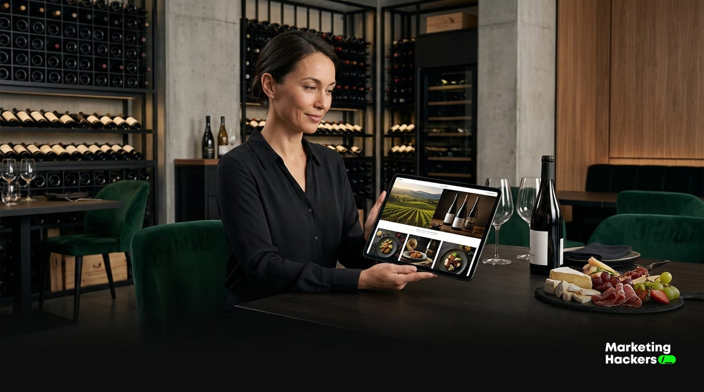
An 80-euro bottle leaves your cellar carrying three generations of family history, a south-facing slope and a hand-picked harvest. Online, it shows up as one line in a price list: bottle size and alcohol content. Anyone looking at it will value it like a twelve-euro bottle, and your positioning loses its air in a single scroll.
Premium websites for wineries exist to close that gap. A good one lets visitors feel the terroir before they see the price, then turns that story into tasting bookings, wine club sign-ups and direct sales. The same goes for a fine-dining restaurant, where the chef’s hand carries as much weight as the vintage does for you. Here’s what actually changes once you stop treating your website as a warehouse for labels.
Why a winery website can’t be a catalogue of labels
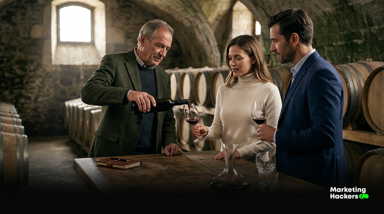
Most winery websites work like a digital shelf. A grid of product cards, a contact form at the bottom, maybe a shopping cart. That’s how a supplier talks, and it puts you on the same footing as the co-op selling bulk wine at a euro a litre.
Someone spending serious money on a bottle is buying the place, the family and the vintage. If your site gives them none of the three, you’re asking for a premium price while showing them the information you’d give for a mass-market product. The gap between what the bottle is worth in the glass and what it’s worth on the page is the main reason a wine tourist closes the tab, and your margin walks out with them.
A site built as a guided experience flips that logic. The principle behind cinematic premium websites for brands works for a winery too: the visitor moves through a story and reaches the price list already sold on the number they see.
The harvest already reads like a script for telling your winery’s story online
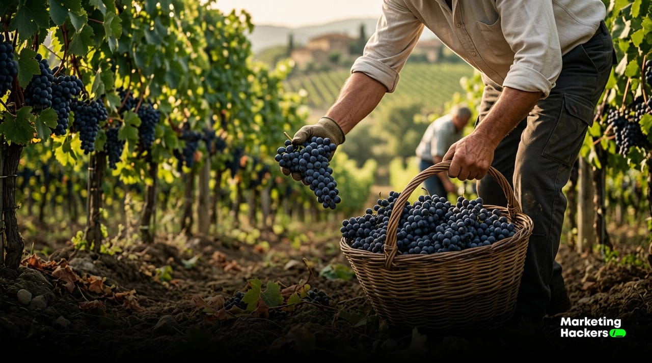
The wine year has the shape of a story. Every stage brings a strong image and an emotional beat, and scrolling lines them up without asking the visitor to click anywhere. That’s scrollytelling, applied to material that could have been written for it.
The scenes that work, and the job each one has to do:
- Soil and terroir. Close-ups of the ground, the aspect, the altitude. This builds credibility and explains in ten seconds why the wine tastes of that place.
- Rows and seasons. The vineyard shifting from March to October. It adds emotion and a sense of time, and shows there’s a full year of work behind the bottle.
- The harvest. Hands, crates, the race against the rain. This is the hard evidence, the effort that justifies the price.
- Cellar and ageing. Barrels, temperature, months of waiting. It shows expertise, the craft customers never get to see.
- The glass. The tasting, the colour, the call to act. It ends with an action: book a visit or add the bottle to the cart.
The hard part is deciding what to cut. Not everything deserves a scene. If ageing in tonneaux is your signature, give it room and drop the generic farmhouse panorama that appears on a hundred identical sites. For a fine-dining restaurant the script changes subject and keeps the method, with the seasonal menu and the chef’s technique standing in for the vintages.
The data backs up the instinct. An experimental study with 186 participants measured what happens when a website gives users active control over navigation instead of having them scroll passively past content. Sites with high active control generate cognitive involvement and, in several cases, emotional involvement too, and greater involvement with the site leads to higher purchase intention.1
One site, two audiences that shouldn’t be mixed
Your winery is talking to two different people who want opposite things. The tourist is after a feeling and a free date for a visit. The importer wants a tech sheet and a sales contact within three seconds. Put them on the same path and you lose both.
| Goal | Audience | What the site needs |
|---|---|---|
| Book tastings and visits | Wine tourists, wine club members | Bookable calendar, photos of the experience, clear pricing |
| Direct bottle sales | End consumers | E-commerce with age verification, shipping by country |
| Orders and distribution | Importers, overseas hospitality trade | Downloadable tech sheets, private area, export contact |
Wine tourism: the shortest route to a booking
The consumer visitor decides on gut feeling. They’ve seen a photo and want to come on a Saturday in October. The site has to take them from story to booking without making them hunt for a phone number. Every extra click between wanting it and the calendar is a lost booking.
Wine exports: where technical substance counts
The trade buyer is impatient and wary of vague quotes. They want to download the vintage sheet, check your certifications and find out whether you ship to their country. Multilingual support here is a structural decision tied to the markets you genuinely sell into. Budget for it from day one and build it into the architecture, long before someone bolts on a plugin the week of launch. Selling alcohol online also comes with real constraints you need to price in from the start, from age verification to country-by-country shipping restrictions.
Multilingual wine sheets are the slowest, most tedious part of the project. A model like Claude or ChatGPT can save you days here, as long as you steer it properly. A prompt along these lines does the job.
“Translate this wine sheet from Italian into English and German for an audience of importers. Keep technical winemaking terms such as malolactic, bâtonnage and tonneau unchanged, adapt the tasting notes to the palate of the target market, use the restrained tone of a technical sheet, maximum 120 words per language. Here is the sheet: [paste the text].”
Your export manager reads the output before it goes live. The AI drafts thirty sheets in an hour; the human review makes sure malolactic doesn’t turn into something else entirely in German.
From cellar to table: restaurants and fine-dining venues
Web design for fine-dining restaurants runs on the same narrative framework, with a different conversion at the end. A table booking replaces the bottle sale, and the menu, so often a dead PDF updated once a year, becomes living content that changes with the season. The dishes are photographed properly, and a curated wine list gets treated as part of the restaurant’s identity.
The scroll-led story stays the same. The pace changes: it’s shorter, because someone looking for dinner tonight has less patience than someone planning a day out at a winery. For places that also offer accommodation, such as farm stays and country inns with their own cellar, the rules for luxury hotel websites apply, with room bookings woven together with table bookings.
There’s a deeper reason the experiential approach pays off in this space. Luxury in hospitality revolves around exclusive, authentic experiences, with the focus shifting from price to value.2 And research on the online communities of a luxury hotel brand, based on fifteen interviews with managers, fifty with customers and a netnography of the brand’s community, shows that enjoyable, experiential content drives the highest engagement.3 A well-told photo of a dish does more work than ten lines describing the dining room.
Beautiful images and a fast site, both at once
This is the technical objection you’ll hear first. Vineyards at sunset, barrels in half-light and high-resolution plates are heavy, and video is heavier still. A premium winery site that takes eight seconds to load cancels out its own luxury feel, because the visitor leaves before the first scene appears.
You can manage the trade-off without sacrificing quality. What to ask whoever builds your site:
- Modern image formats like WebP and AVIF instead of 3 MB JPEGs: the same perceived quality at a third of the weight.
- Progressive loading, with the first screen prioritised so visitors see something straight away while the rest arrives.
- Lightweight image sequences in place of video wherever real motion adds nothing.
- Each photo sized for its slot, so nobody is loading the 8 MB shot straight off the photographer’s DSLR.
- Mobile testing on a real-world connection, and not only on the studio’s fibre line where everything flies.
How those pieces fit together technically is the job of whoever builds the site, and they’ll pick the best tech stack for cinematic sites. All you need to know is that speed and beauty can coexist when the work is done well.
AI speeds up the slow parts, the story stays yours
Tasting notes and the copy for each scroll scene are the other bottleneck. Writing a dozen that don’t all sound the same takes time, and the copy often sits empty for weeks while the site is otherwise ready. Here too, the AI works from your own technical notes. The prompt puts them in front of it.
“You are a winemaker writing for the winery’s website. Using these notes on the 2022 Sangiovese vintage [paste the notes], write three sentences for the harvest scene: one about the work in the vineyard, one about the vintage’s weather, one about the feeling of the first taste. Concrete and sensory, no empty adjectives, maximum 20 words per sentence.”
What comes out is a draft to polish. The difference between a premium site and one that merely looks premium lies with whoever rereads, cuts and corrects that draft in the winery’s real voice. Automation gets you past the blank page; the design team takes you from draft to a site that sells the bottle for what it’s really worth.
The practical starting point is simple. Take your five scenes, decide which two audiences you serve and in which languages, then hold your current site up against those two yardsticks. If today it shows a grid of labels and a contact form, you already know where you’re losing margin on every visit.
Sources
Further reading
- Immersive websites for luxury real estate and prestige villas
- Cinematic websites for premium fashion brands
Footnotes
-
Effects of Interactivity on Website Involvement and Purchase Intention. aisel.aisnet.org ↩
-
The Emerald Handbook of Luxury Management for Hospitality and Tourism. play.google.com ↩
-
Luxury brand value co-creation with online brand communities in the service encounter. sciencedirect.com ↩
FAQ
Why shouldn't a winery website be a catalog of labels?
A grid of product pages makes you look like a supplier and puts you on the same shelf as bulk wine. People who buy a serious bottle are paying for the place, the family and the vintage. If your site doesn't deliver those three things, perceived value drops and your margin leaves with the visitor.
How do you tell a winery's story online effectively?
The wine cycle already has the shape of a story. Scrollytelling lines up the stages (soil and terroir, vines through the seasons, harvest, cellar and aging, the glass) without asking visitors to click, and walks them to the price list already sold on the price.
Which scenes should a premium winery website include?
Five scenes do the heavy lifting: the soil, with exposure and elevation; the vines changing through the seasons; the hands at harvest; the barrels during aging; and finally the glass, paired with a clear call to action. Each scene has one emotional goal and one specific moment to land.
What should you cut when designing a winery website?
The hard call is what to leave out, because not everything deserves a scene. If aging in tonneaux is your signature, give it room and drop the generic estate panorama that shows up on a hundred identical sites. Cutting is how the things that set you apart rise to the top.
Does this approach work for gourmet restaurants and food brands too?
Yes. For a restaurant or gourmet brand the subject changes but the method holds: instead of vintages you show the seasonality of the menu and the chef's craft. The chef's hand carries the same weight a vintage carries for a winery.