Small Business Websites and Landing Pages: The Complete Guide
How to choose between a brochure site, a conversion landing page, an online store or a premium site for your small business, with costs and timelines.
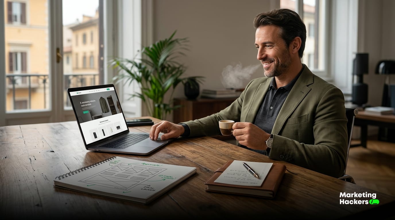
A website and a landing page do different jobs, and starting from a template is the surest way to find that out too late. A website tells people who you are, serves several goals at once and builds trust over time. A landing page chases one action and lives or dies by it.
Before you open a page builder, write down what the page has to do. Bring in leads? Book appointments? Build your reputation? Then decide how you’ll measure whether it worked.
This guide takes things in the right order: the process, what it costs and how long it takes across four scenarios, and the points where AI saves you real hours.
Do you need a brochure site, a landing page or a premium site?
Four tools, four jobs. Mix them up and you’ll usually spend money in the wrong place.
A brochure site is your company’s permanent home online. It shows your services, your work and how to reach you. It’s for people who already know your name, or who’ve found you and want to decide whether to trust you. A complete, well-kept site lets a business present itself the way it wants to be seen 1. Think of it as a business card that works around the clock.
A standalone landing page chases a single action: book a slot, leave a phone number, download a quote. You judge it on its conversion rate, the share of visitors who take that action. Improving that rate means shaping the whole experience around getting people there 2.
A premium “cinematic” site is a brochure site built to make an impression, with scroll animations, video and carefully shot photography. It earns its keep when the brand itself is what you’re selling: an architecture practice, say, or a winery that sells its positioning before it ever mentions price.
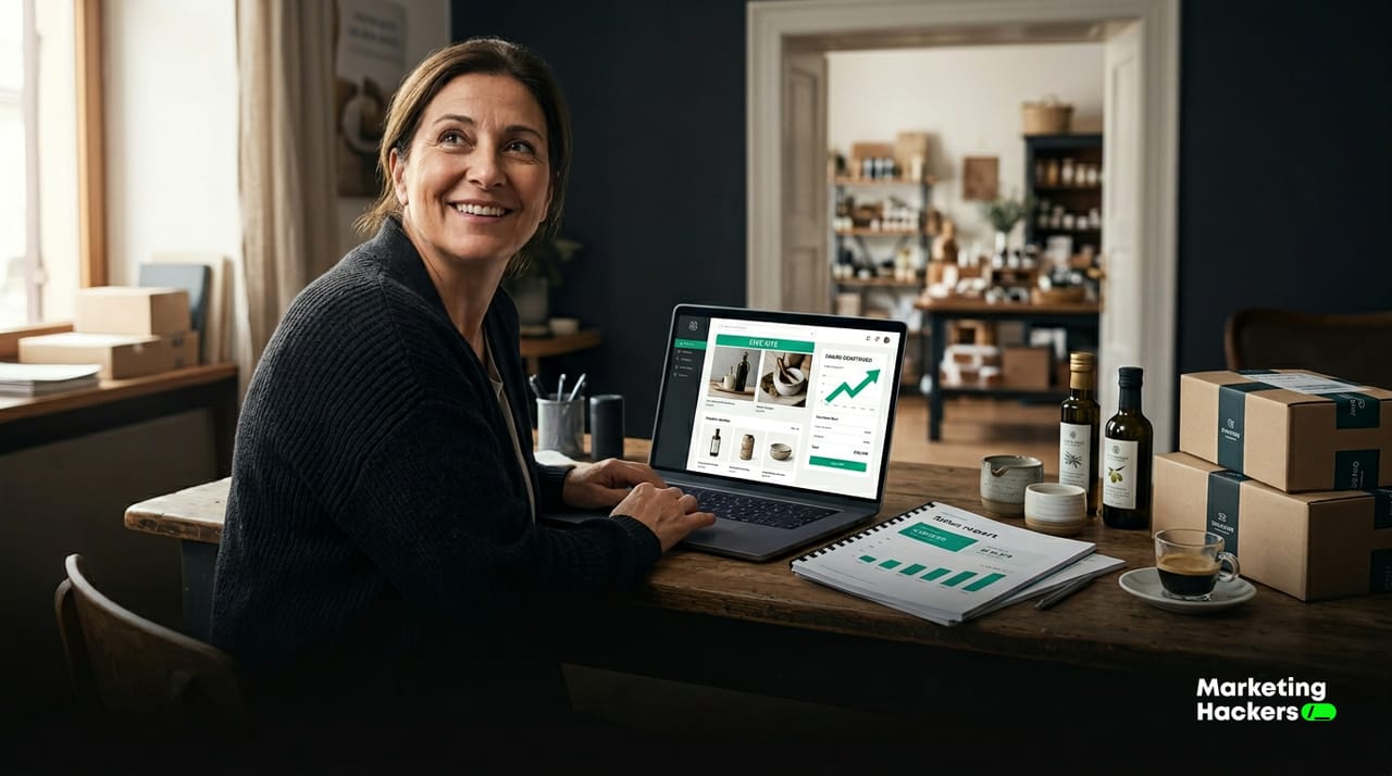
An online store puts a cart, checkout and shipping on the page, but most of the work happens off-screen. A catalogue lives on daily upkeep: prices, stock levels, orders to pack, returns to handle and new photos for every product. Open one without someone minding all of that every day and you end up with a fixed cost and a website that no longer matches what’s on your shelves.
Two practical tests decide it: how many products you sell and how far away your customers are. A business with ten products and a local customer base usually sells more with a catalogue inside its brochure site, prices on show and orders taken by WhatsApp or phone, because running it costs next to nothing. Past fifty products, with shipping beyond your area and customers who buy at eleven at night, a cart pays for itself. If you’re somewhere in between, take the middle road. Start with the catalogue, count the enquiries that actually come in over two or three months, and add the cart once the numbers back it up. An artisan pasta maker shipping nationwide needs a cart. The same shop delivering within six miles takes more money with a well-made product page and its WhatsApp number front and centre.
| Main goal | Recommended type |
|---|---|
| Get found and earn trust | Brochure site |
| Generate leads for a specific offer | Conversion landing page |
| Sell catalogue products with online payment | Online store |
| Sell the brand and its positioning | Premium cinematic site |
A hairdresser who wants to fill Tuesday mornings doesn’t need an eight-page website. A landing page will do: photos of her work, clear prices and a button that opens WhatsApp or the booking calendar. An accountant who wants larger, more established clients needs a brochure site with case studies, articles and a believable About page, because authority is what wins that decision.
Sometimes the smart move is to rebuild nothing at all. If your current site is decent and the only problem is that it doesn’t bring in leads, add a landing page for one specific offer and tidy up your Google Business Profile. Scrapping everything and starting over is rarely the answer.
The right 6-step process, before you touch the design
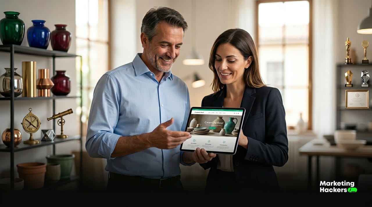
Most guides start with the template. That’s backwards: design is the last layer of the job. Here’s the order that actually works.
-
Set a measurable goal. Swap “I want a nicer website” for “I want ten quote requests a month” or “I want twenty online bookings a week”. Without a number to hit, you’ll never know whether it worked.
-
Map your audience and the one action you want from them. Who lands on the page? What do they already know about you? What exactly should they do next? Write it in one line. A page that talks to everyone persuades no one.
-
Write the content and gather your social proof first, then think about design. Copy, genuine reviews, the numbers behind your results and real photos of your work. Content dictates form. Fill the page with lorem ipsum and leave the copy for later, and the design has nothing to hang on.
-
Sketch the page structure in plain text. A text wireframe is simply a list of sections in the order they appear, with the purpose of each one. For a landing page, that usually runs: the promise at the top, then the problem, the solution, social proof, the offer and the call to action. Work out how many sections you need before you think about images.
-
Pick the tool that fits the project. A page builder for a quick landing page, a CMS like WordPress for a site that will grow, an outside partner if you have neither the time nor the skills in-house. Digital adoption among Italian small businesses is still patchy. According to Politecnico di Milano’s Digital Innovation in SMEs Observatory, only 24% invest heavily across every area, while 22% consider digital marginal to their business 3. The right tool is the one you can actually keep running.
-
Launch, measure, adjust. Version one won’t be the final version. Send traffic to it, see where people drop off and change one thing at a time. Launch day is when the real work starts, because that’s when the first data comes in.
A restaurant owner redoing their site usually starts with the menu, their Google reviews and photos of real dishes, and picks the template last. Once the content is ready, choosing a design takes half a day instead of a month of dithering.
Where AI speeds things up, with ready-to-use prompts
Claudio Rorato, director of Politecnico di Milano’s Digital Innovation in SMEs Observatory, puts it well when talking about AI in general: it’s “a powerful technology, but it requires vision, skills, the right processes and a data culture” 3. AI speeds up a process that’s already well set up. If you haven’t decided on your goal, no model will decide it for you. Consider that 76% of Italian SMEs neither invest nor plan to invest in AI 3, often because they treat it as a stopgap when it works best as an accelerator for a sound method.
There are three points in the process where AI saves you real hours. Copy these prompts and adapt them to your business.
1. Page structure. Use AI to turn your goal into a skeleton of sections.
Act as a B2B copywriter. For a [type of small business, e.g. car
body shop] that wants to [goal, e.g. get quote requests for hail
damage repairs], propose a section-by-section structure for a
landing page. For each section, give its purpose, a suggested
headline and the CTA. No filler copy, 7 sections maximum.
2. First-draft copy. Feed it five true facts about the business and get back a first draft to edit.
Write the landing page copy based on these 5 points:
1) [what you do], 2) [who it's for], 3) [the concrete result you deliver],
4) [one piece of proof: a review, a number, years in business],
5) [the action I want: a call, a form, WhatsApp].
Direct tone, natural plain English, short sentences. No superlatives.
3. Brief for whoever builds or lays out the page. Once the copy is signed off, generate the working document for your designer or developer.
From the content below, write a technical brief for a designer:
section order, visual hierarchy, where the images go,
which elements must sit "above the fold", and how the CTA
behaves on mobile. [paste the approved copy]
Always reread and edit what the AI gives you. The data, the reviews and the numbers behind your results come from you, because they’re real and the AI has no way of knowing them. Copy on a small business website that quotes made-up figures does more damage than copy you never wrote.
What it costs and how long it takes: four scenarios
Page-builder guides leave this part out, because they have a conflict of interest. The figures below are typical market ranges, based on our own experience with projects for Italian SMEs, not on official statistics. Use them to get a sense of scale before you ask for quotes.
| Scenario | Ballpark cost | Time | When it makes sense |
|---|---|---|---|
| DIY with a page builder | €0–300/year + your time | 10–30 days of your own work | Budget close to zero, one simple landing page, you have the time and the appetite to learn |
| Freelancer | €1,000–4,000 | 20–40 days | You want a custom site without an in-house team and your content is already written |
| Traditional agency | €5,000–20,000+ | 45–90 days | Complex project, integrations, you need a supplier with a proper team behind it |
| AI-driven partner | €1,500–6,000 | 10–25 days | You want quality and a fast turnaround, with automated processes cutting the hours |
What pushes the price up: the number of pages, content that has to be created from scratch (copy, photos, video), integrations with your management software, CRM or booking system, and how custom the design is. A single landing page with the copy already written sits at the low end of every scenario. A fifteen-page site with a members’ area sits at the top.
DIY isn’t free. Your time has a cost, and ten days spent wrestling with a page builder are worth more than you’d think. A traditional agency makes sense when the project really is complex, and far less sense for a booking page. The model of a partner combining human expertise with automated processes exists to fill the gap where most small businesses get stuck: agency-level quality at a cost and pace they can sustain.
The mistakes that waste your budget
We see the same ones on almost every project that comes to us after a bad start.
Starting from the design instead of the goal. The site looks great and doesn’t bring in a single lead, because nobody decided up front what it was meant to achieve.
Cramming everything onto one page. A brochure site, a shop, a blog and bookings squeezed together confuse visitors and scatter every action.
Vague copy is the same problem. “Professionalism and passion” convinces nobody. What works is your own numbers, genuine reviews and photos of real jobs.
Forgetting about phones. Most of your traffic comes from mobile. If the contact button isn’t visible without scrolling, you’ve lost half your enquiries.
Leaving the site disconnected from the tools you already use. In its estimates of how businesses use their websites, Istat, Italy’s national statistics office, points to practical features that are often missing, such as online ordering, links to social media and job openings pages 4. A site that isn’t connected to anything else is just a static brochure.
What to track after launch
Salaries get paid by the leads you generate and what each one costs you. Those are the two numbers to judge your site on.
For a landing page, watch three things. How many forms come in and how many calls get made, which are your real conversions. Your conversion rate, meaning the percentage of visitors who take the action. And where your best leads come from, so you know where to spend. A good landing page is judged on those three numbers.
For a brochure site the signals are less direct, because its job is building trust. Look at how many people reach the contact page, how long they spend on your case studies and how many enquiries mention “I found you online”. Set up some form of tracking from day one, even a simple one, and check the numbers every week for the first month. Change one thing at a time so you know what made the difference.
There’s another layer underneath: page speed, which on its own can wreck your conversions. Google measures it with three numbers it calls Core Web Vitals. The first is how long the main content takes to appear above the fold (LCP, Largest Contentful Paint); past 2.5 seconds, visitors leave before they’ve even read your promise. The second is how much the page jumps around while it loads, with buttons sliding and text shifting as images arrive (CLS, Cumulative Layout Shift); above 0.1 it’s noticeable and annoying. The third is how quickly the page responds when you click (INP, Interaction to Next Paint); past 200 milliseconds it feels broken. For a small business, the bare-minimum check is Google’s free PageSpeed Insights. Paste in your URL and within a minute you have all three numbers plus a list of things to fix. A slow landing page converts less, however good the copy on it is.
This is where Italian SMEs lag behind. A data culture still isn’t widespread, and without measurement a website stays a cost when it could be a sales channel. Among businesses that do invest in digital, the share that invests heavily and across every area is still a minority 3.
Sources
Further reading
- What is a landing page: definition, types and when you actually need one
- Business websites for SMEs: speed, hosting and showing up on Google
- How to get seen on Google Maps: a guide for restaurants and local businesses
Footnotes
-
modello di maturita’ per i sistemi informativi. politesi.polimi.it ↩
-
Marketing e Comunicazione online a supporto del mercato … politesi.polimi.it ↩
-
PMI e digitalizzazione: il 76% delle aziende non investe in AI. osservatori.net ↩ ↩2 ↩3 ↩4
-
Stime delle modalità di utilizzo dei siti web da parte delle imprese - Anno 2018. istat.it ↩
FAQ
Should my small business have a brochure website or a landing page?
It depends on the goal. A brochure website helps people find you and trust you: it serves several purposes and shows your services and past work. A landing page chases a single action, like booking a call or leaving contact details, and is judged on its conversion rate.
Where do I start when building a website or landing page?
Start with a measurable goal, not a template. Write down what the page has to do and how you will count it, for example ten quote requests a month. Design is the last layer of the process, not the first.
What is a cinematic premium website and when is it worth it?
It is a brochure website built to impress, with scroll animations, video and carefully shot photography. It pays off when the brand itself is what sells, for example an architecture firm or a winery that sells its positioning before its price.
Do I need to rebuild my existing website to get more leads?
Not always. If your site is decent but brings in no leads, it often makes more sense to add a landing page for one specific offer and work on your Google Business Profile than to scrap everything and start over.
How do you measure whether a landing page is working?
By its conversion rate, meaning the share of visitors who take the action you asked for. That is why a landing page has one goal and no navigation menu to pull attention away.